- The Design Manager's Field Guide
- Posts
- Setting Design System Priorities... with Excel?
Setting Design System Priorities... with Excel?
My best Clippy impression, but helpful.

I often say that Excel is my favorite design tool, and sometimes I'm actually serious. And while I have received client wireframes mocked up in Excel in past lives, that's not exactly what I mean. Excel can be a powerful collaboration tool for designers in the proper contexts. One of which is driving alignment on design system decisions, especially in the early stages as part of a component audit.
One of the first steps in setting up a design system is first understanding what you and your team already have. How many variations of a button, checkbox, filter bar, input field, icon, et cetera exist? Which one of these variations should be the "one to rule them all"? Then there's another challenge: how does a design leader make these decisions at pace without sacrificing the combined expertise of their team?
Principles first
A component audit is essential, but principles take a centralized style guide to a proper design system. Principles reflect you and your team's core beliefs about design and how it can improve the experience of those who use your products. If components and patterns are the body of the design system, then principles are its soul. They should be aspirational yet grounded in heuristics. If you have not worked with your team to set principles for your system, here are some examples to take or leave as thought starters:
Simple: Minimal, aesthetic design. Just enough structure to signify affordance.
Intuitive: Understandable at first glance, the meaning of the element in its environment and how to interact with it.
Flexible: It can meet many use cases.
Inclusive: Accessible by design; a non-negotiable.
Consistent: Feels like part of the system and overall brand expression.
Principles don't need to be complex or flowery, but they must be foundational. Once aligned, socialize them to all who will listen and get in the habit of asking in design reviews: how does this design reflect our core principles? Solid principles can apply beyond design, as well -- how does this omnichannel experience reflect our universal principles?
That sweet, sweet Excel action
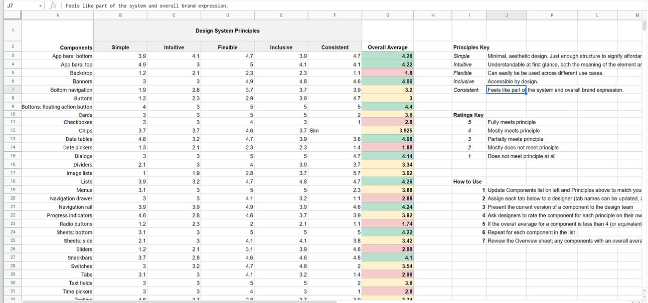
Now, the moment you've been clamoring for: the magic spreadsheet! Combining principles with the component audit or inventory, and then a collaborative grading activity, is where said magic lies. The components identified in your audit make up the first column of the spreadsheet, while the aligned principles appear across the top row as the grading rubric. Each component is to be rated for each principle on a 5-point Likert scale: a 5 means fully meets principle, and a 1 means does not meet principle at all. Here is how the activity works:
Facilitator level sets designers on the principles rubric (ideally, the principles are not a surprise to anyone at this point).
Facilitator opens the floor for questions and clarification.
Facilitator or Designer demonstrates an existing component.
Designers enter principle ratings for the component on their sheets. Facilitator should encourage designers to leave questions or feedback, especially if they score the component lowly. The comments will be revisited as part of a review discussion.
Repeat until the component list is exhausted.
Facilitator shares the Overview sheet. With all scores set, the "Overall Average" column will automagically show how the team feels about each component in its current state. By default, the sheet will highlight components with an average of 4 or above green, 3 yellow, and 1 to 2 red. Low-scoring components can be reviewed for needed changes as part of the same session or in a separate one.
At the end of the activity, component redesign priority should be apparent through the team's combined expertise.
If you’d like to give the activity and spreadsheet a try, you can download the example spreadsheet pictured above here:
The components listed are a straight lift from Google’s Material Design, so feel free to update with your own components and labeling. Most everything else can be changed, as well — just be sure changes made are reflected across all sheets that designers/reviewers will be using.
This Week in Sonder & Rise:
Friday, Match 18, 11AM EDT:
Guesting on Experience Friday Live! with Shawn Nason and Michael Harper
You can catch me live on LinkedIn chatting experience design and product at 11am eastern with Shawn Nason, a former Disney Imagineer and experience ecosystem thought leader, and Michael Harper, an experience designer, facilitator, and innovation leader. The show will be recorded.

Saturday, Match 19:
The Sonder & Rise Podcast Episode 2: Design, Product, and Hip Hop
The second episode of the podcast will go live this Saturday. Mike Crawford, senior product leader at Shopify, will be my guest as we discuss the “Crying Jordan” memes of our product careers, the importance of job titles in both startups and growing companies, and how hip hop, rap, and product management are more similar than you may think. Here’s a teaser: